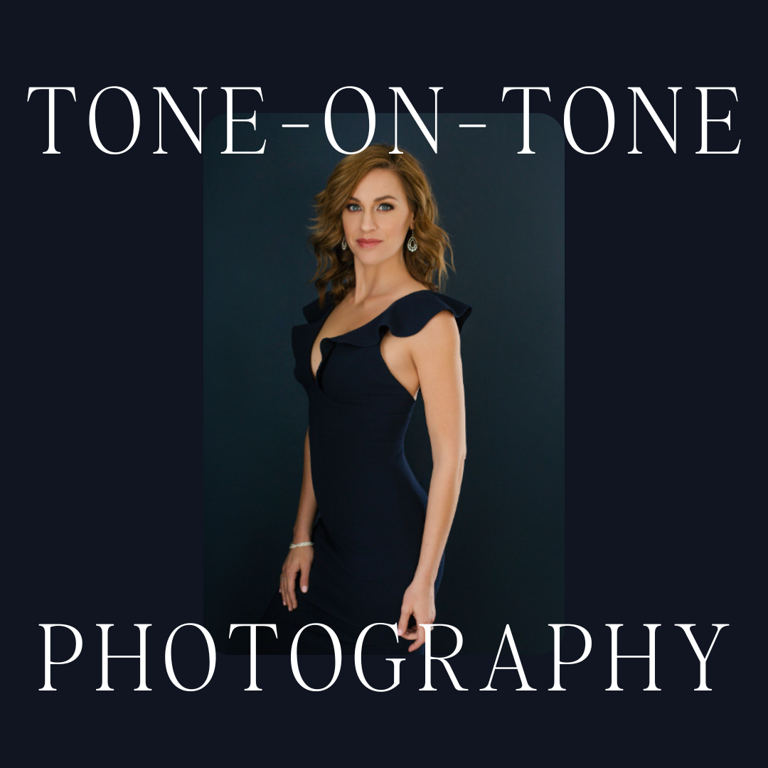
Are you struggling with choosing your backdrop colors? If so, you’ll LOVE this blog post because I’m sharing my top six tried-and-true background colors that I use in my own studio!
Choosing the paints for my backdrop colors has been a labor of love for me over the years. I’ve picked some that I’ve been so happy with and have used over and over for the last decade! And then, I’ve chosen some backdrop colors that I’ve used once and hated them.
Keep in mind that colors can look vastly different in your photos based on several factors, including:
– white balance
– lighting setup
– filters you use in editing
So, full disclosure that if you use the same colors that I use, you may get a different result. Also, if you love one of my colors, don’t feel like you have to stress about getting the exact same one if you can’t find it–just grab a bunch of similar paint chips at the hardware store and take them outside and see what you like best.
The Backdrop Colors You’ve Been Waiting For
My newest love is called Peach Burst by Valspar. This dark warm pink is so flattering, especially on clients who have pink undertones. To be completely honest, I can’t say that the top photo is for sure Peach Blast, BUT, I compared the paint chip of Peach Blast to the wall and it was almost identical.
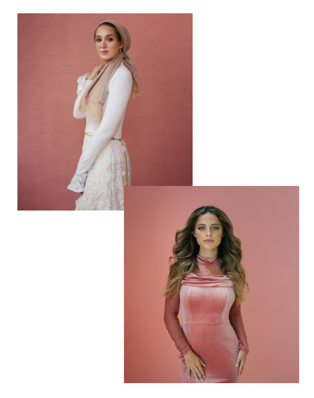
Next, we have Rose Quartz by Backdrop. This neutral light pink is beautiful for almost every single client! It’s definitely a favorite of everyone who comes into the studio. And I love it so much that I used it for one of my own headshots 🙂

I have four other go-to paints for my background colors, and I’d LOVE to share them with you! Just fill out the form below, and I’ll send them directly to your inbox!
See you next time!
