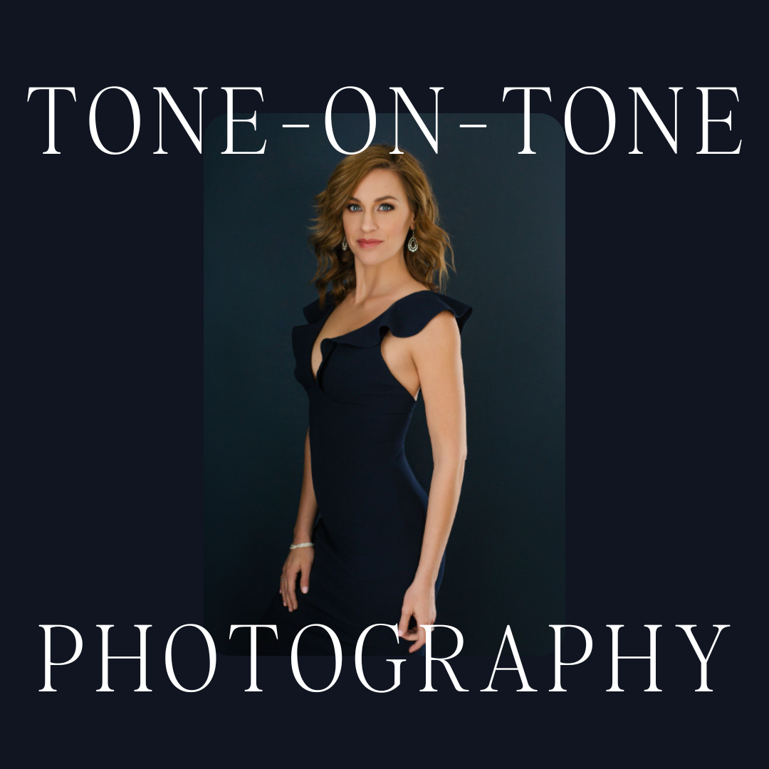
One of my favorite methods of shooting is tone-on-tone where the backdrop and clothing are mostly the same color.
Tone-on-tone photography creates visually stunning images for three main reasons:
1. It creates visual harmony and cohesion allowing the viewer’s eye flows smoothly across the image without any jarring color contrasts. It also brings a calming and aesthetically pleasing effect, evoking feelings of elegance and simplicity.
2. It eliminates distraction and subtly shifts the viewer’s focus directly onto the subject, emphasizing their presence and features. It’s particularly effective in highlighting textures and shapes! I think that this element of focus is so important in branding photography!
3. By choosing certain colors to evoke specific feelings and emotions, it can create an immersive experience for the viewer. This technique is highly effective for clients who want their personal branding images crafted to elicit specific emotions or consumer responses. If you want to read more about the psychology of color, check out this article from The Art Therapy Blog!
There is something I LOVE about shooting navy on navy and I always get excited when my clients bring a navy outfit! These navy images make me feel calm and also like I can trust the people in them, which makes sense since blue evokes calmness, serenity, wisdom, focus, and loyalty!


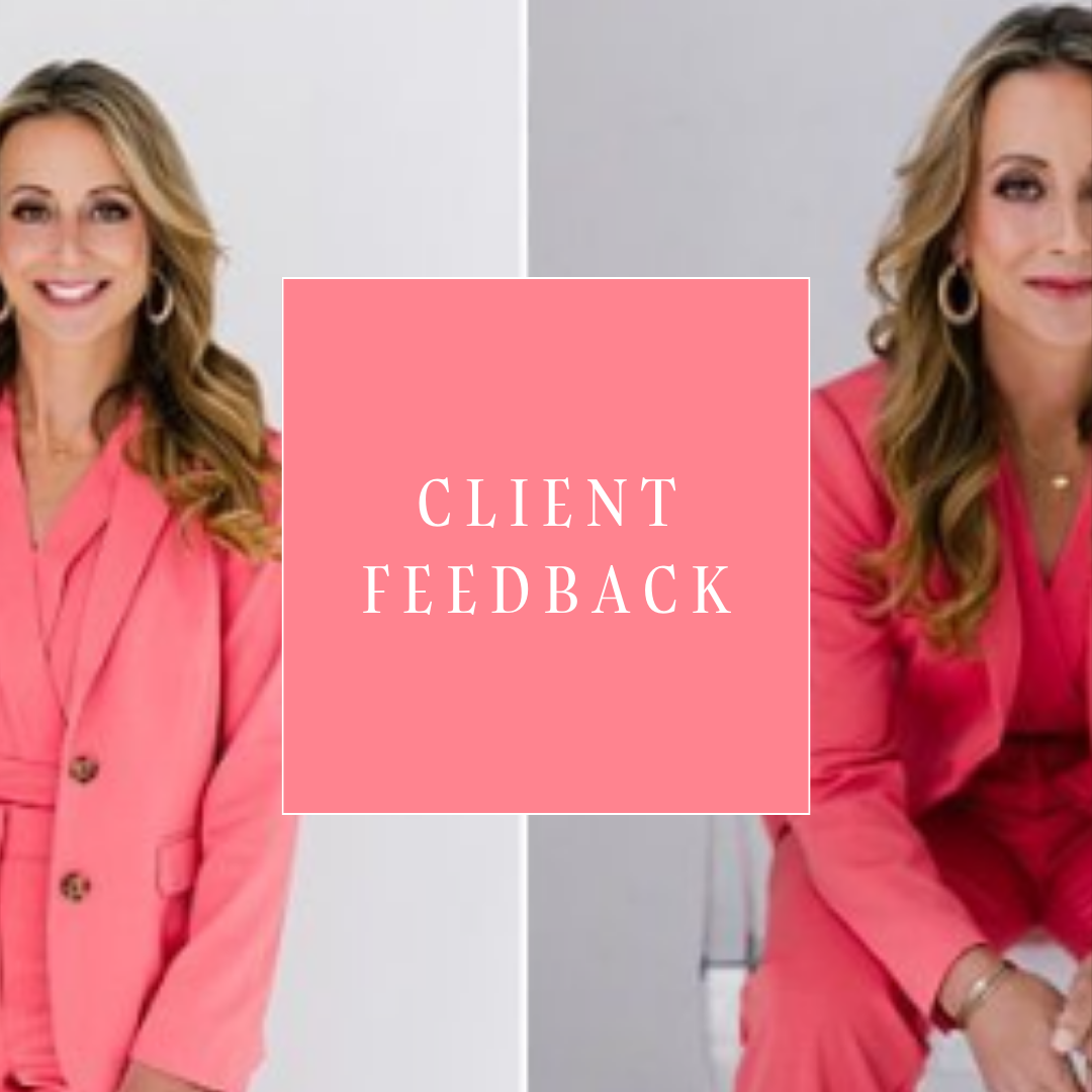
In this next example, it’s all about pink. Both of the photos you see below are shoots in my Outdoor & On-Location course! Pink tends to evoke feelings of fun, romance, and love. It’s always a great addition to my clients who want images for dating sites, as well as clients who come in and want fun, celebratory images, too!


Ivory on ivory (and white on white) is also one of my favorites! This is one of the most common tone-on-tone sets that I shoot. White/Ivory is all about innocence and simplicity.


Next up is an emerald green example. Green evokes feelings of tranquility, harmony, and growth. It’s fantastic for clients who are coaches, mentors, and business owners. It’s also great for clients with lighter eyes!
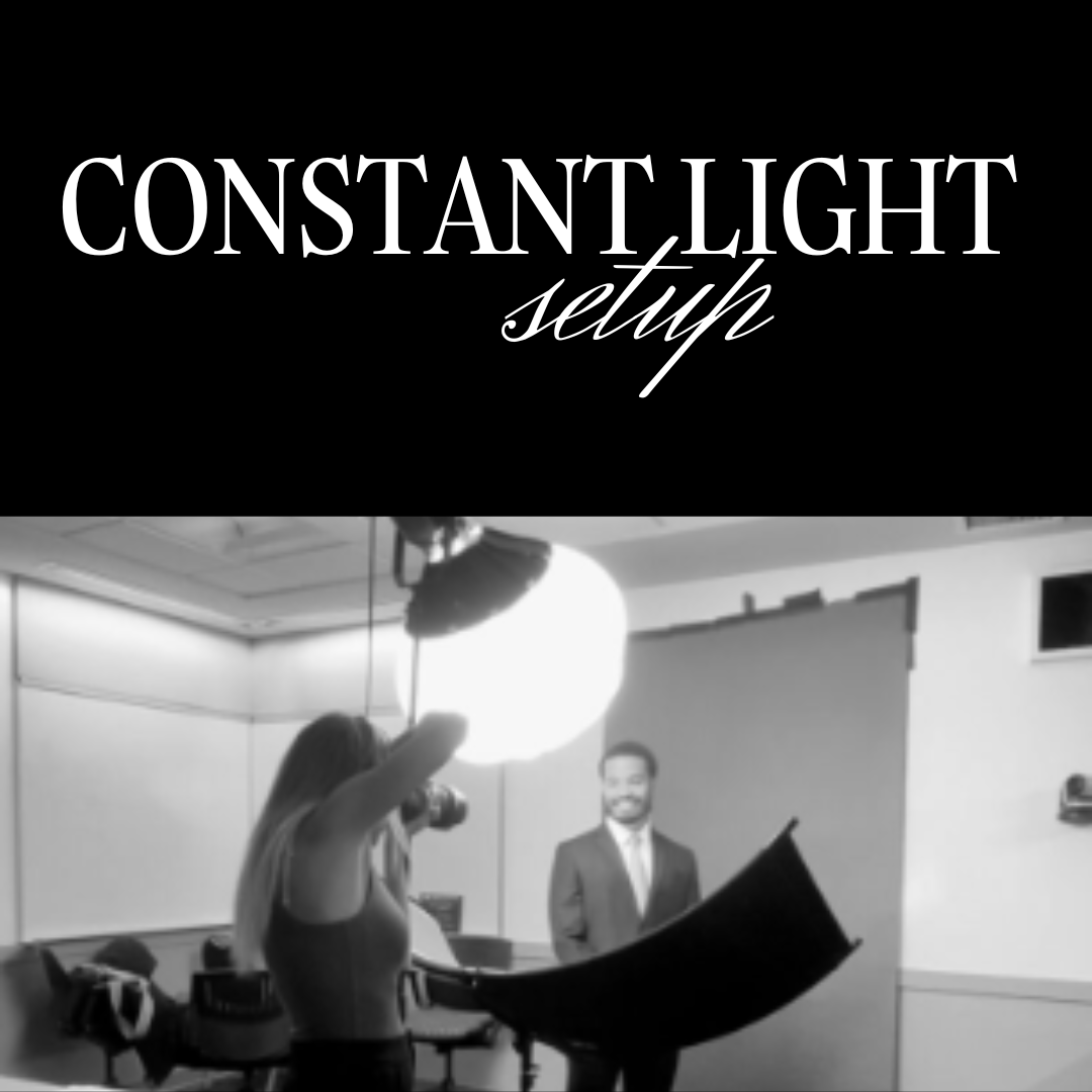
You’ll notice in the second example of Chelsea that the tone leans a little more towards turquoise than the first photo of Amy. It’s the same backdrop, but with Lightroom’s new background AI selection, you can easily shift a background towards another hue like this turquoise look!


I’m sure I’ll continue painting v-flats different random colors and I’ll have more examples to share in the future! See you all next time!